You spend days building a free gift and sending clicks to a signup page. Then you watch people leave without typing their email. Real results come from cutting friction and keeping your layout clean.
The Short Version
- Cut every navigation link so visitors have only one action to take on your page.
- Ask for an email address only because extra form fields destroy signup rates on mobile screens.
- Deliver your promised freebie instantly using an automated welcome email and simple confirmation page.
Jump to Section
- Strip Away Every Distraction to Protect Your Attention Ratio
- Cut Your Form Fields Down to Just an Email Box
- Hook Mobile Readers with One Crystal Clear Promise
- How to Improve Your Design: Opt-In Page Converts Without Hassle
- Deliver the Freebie Instantly with Automated Follow-Up
- Launch Your Simple Page and Start Collecting Leads
- Frequently Asked Questions About Opt-In Page Design
Strip Away Every Distraction to Protect Your Attention Ratio
Your landing page can fail before a visitor even scans the first line. When someone clicks your link, their attention span is tiny. If they see a header menu, social icons, or recent posts, they wander off and leave.
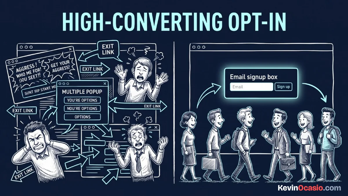
Every extra link acts like an open exit door. You worked hard to bring that person to your page. You can’t afford to give them ten ways to leave. Your page exists for one job: turning a visitor into a subscriber.
Keep a clean one-to-one attention ratio on the screen so visitors have only two choices. They can type their email to grab the gift, or they can leave. Removing header menus, sidebars, and footer links keeps eyes on your offer.
I strip all standard site elements off my signup pages. That means no menu bar, no links to an about page, and no search box. Clean white space gives your message room to breathe and lets readers focus on what you have to say.
Cut Your Form Fields Down to Just an Email Box
Nothing kills signup rates faster than a long form. Some marketers ask for a first name, phone number, and company size for a three-page cheat sheet. Every extra box adds friction for your visitor.
Mobile visitors feel this friction the hardest. Typing on a small phone screen is slow. Dropdown menus make people bounce in seconds. If someone has to fight autofill bugs on their device, they’ll give up and leave.
Stick to a single input field that asks for an email address. If you want to personalize your messages, asking for a first name is fine. Never ask for phone numbers, job titles, or home details on a simple freebie page.
You can gather more details later after building trust. Once a reader is on your list and likes your notes, you can ask questions directly. On day one, your only goal is earning permission to stay in touch.
Hook Mobile Readers with One Crystal Clear Promise
Your headline carries most of the weight on the page. Visitors decide to stay or bounce in less than five seconds. State your exact offer with zero fluff. Vague lines like “grow your potential” mean nothing to a busy reader.
Tell people the exact problem your free gift solves. If you offer a checklist, say how many steps it takes and how fast they can finish it. A headline like “A 5-Minute Checklist to Speed Up Your Site” works best.
Bullet points below your headline should outline clear takeaways. Use short lines that show what the reader gets right away. If you need a strong offer, browse these lead magnet ideas to grow your email list without writing a giant book.
How to Improve Your Design: Opt-In Page Converts Without Hassle
Good visual layout is about clarity, not art. You don’t need fancy gradients or heavy scripts that slow down your server. A high-converting layout puts your headline, a short bullet list, a clean form, and a bold button front and center.
Contrast is what directs the eye. On a white background, use a bold button color like deep red or dark navy. Make sure the button text is active, like “Send Me the Guide” instead of a dull “Submit” label.
Keep your key elements above the fold on mobile screens. When someone opens your link on a phone, they should see the headline, form, and button right away. Visitors bounce if a page takes more than two seconds to load.
Here is how a cluttered signup page compares to a high-converting lean opt-in page:
| Page Feature | Cluttered Opt-In Page | High-Converting Lean Page |
|---|---|---|
| Navigation Menus | Full header menu with social media links | Zero links and zero header navigation |
| Form Fields | Name, phone number, and survey dropdowns | Single email box or first name only |
| Attention Ratio | 10:1 or worse with multiple exit ramps | Strict 1:1 ratio focused on one action |
| Mobile Load Speed | Slow with heavy sliders and large background images | Under two seconds with clean lightweight text |
| Core Offer Clarity | Vague promises buried under paragraphs of copy | Clear benefit stated in the main headline |
Simple pages win because they remove all guesswork. When the next step is obvious, people sign up without hesitation.
Deliver the Freebie Instantly with Automated Follow-Up
The signup process doesn’t end when someone clicks your button. What happens in the next ten seconds shapes whether your new subscriber stays or forgets who you are. Your thank-you screen and email sequence must work together smoothly.
Direct your button to a simple confirmation screen instead of leaving a tiny text note below the form. A clean thank-you page confirms that their signup went through. Tell them to check their inbox right now so they build a habit of opening your emails.
Connect your form to an automated email lead funnel so your welcome note arrives within seconds. I build simple lead capture pages with Systeme.io because it handles funnels and emails without extra fees. Using a dedicated sales funnel builder lets you launch fast pages in less than an hour.
Launch Your Simple Page and Start Collecting Leads
Stop overthinking your design and spending weeks tweaking button colors. The best way to know if your offer connects with real people is to put a simple page online. A clean page with one solid promise beats a draft hidden on your computer every time.
Open your funnel builder today and create a blank page. Remove the header and footer, write a clear headline that solves one problem, and drop in a single email box. Test the page on your phone, send thirty visitors to the link, and watch your list grow.
Frequently Asked Questions About Opt-In Page Design
What makes a simple opt-in page convert well?
A simple opt-in page converts when you remove all menu links and keep the offer clear. Asking for only an email and loading fast on mobile phones lets visitors take action without hesitation.
Should I ask for a first name along with an email?
Asking for just an email gives you the highest signup rate because it creates the least friction. If you plan to use names in your broadcast notes, adding a first name field works fine, but avoid extra boxes.
Do I need mockup graphics or images on my signup page?
A clean 3D cover or worksheet mockup can help readers picture a digital gift, but it’s not required. Many top signup pages use simple text, bullets, and a form on a plain white background.
How long should the text on an opt-in page be?
Keep your text short and focused on a single screen. For a free guide, a bold headline, two sentences of context, and three bullet points are all you need to help visitors decide.
Can I build a high-converting opt-in page for free?
Yes, tools like Systeme.io offer free plans that let you build landing pages and send automated emails without spending cash. You don’t need expensive software to collect leads when you’re starting out.
Where should I send visitors right after they opt in?
Send them to a dedicated thank-you page that confirms their submission and tells them to check their inbox. You can also mention a low-cost digital product on that page while their attention is high.