You can waste weeks building thirty-page sales letters with countdown timers and autoplay videos. Then nobody buys. You don’t need fancy design tricks to sell a good guide. A clean text page that solves one clear problem will make more sales every time.
The Short Version
- Focus on a single offer so your visitors never feel confused about what to buy.
- Cut all site navigation menus to keep readers focused on your checkout button.
- Write short plain-English copy that highlights the transformation your product delivers.
Jump to Section
- Focus on One Pain Point and One Clear Offer
- Write for Fast Readers with Plain Spoken Copy
- Strip Friction and Speed Up Your Page Layout
- How to Write Simple High Converting Sales Page Copy with Lean Tools
- Launch Your First Offer Before You Tweak the Design
- Frequently Asked Questions About Simple Sales Pages
Focus on One Pain Point and One Clear Offer
When you try to sell everything at once, people get overwhelmed. They leave your page without spending a dime. A beginner’s biggest mistake is bundling four products together. Selling three pricing tiers right out of the gate also confuses buyers.
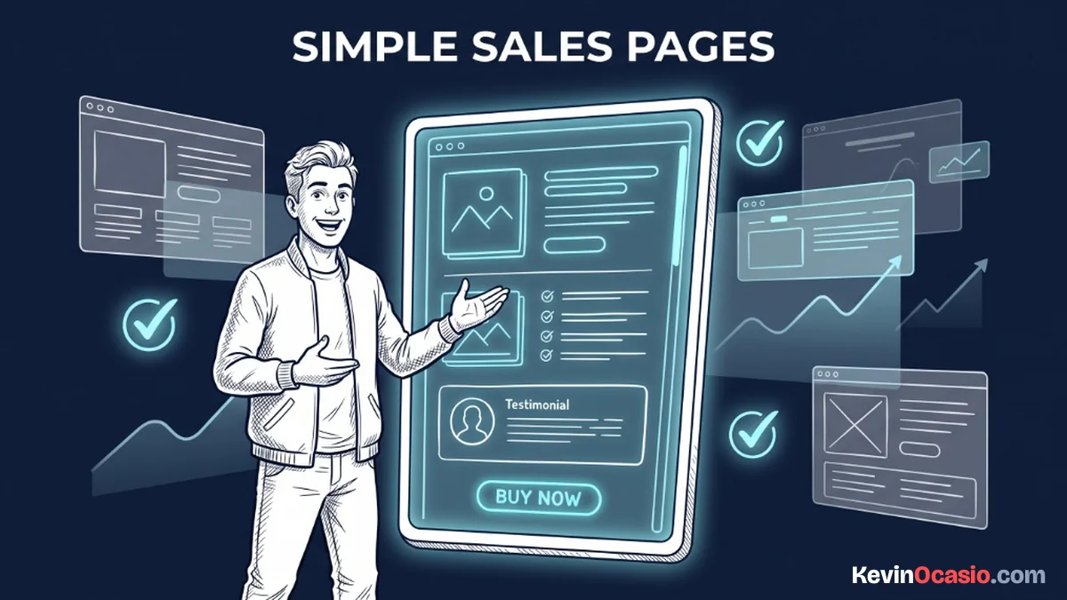
Your sales page needs one clear job. You’re selling a single fix to someone with an urgent headache. Narrow your focus down to one clear outcome. When you do that, your writing gets sharper and readers know the page is for them.
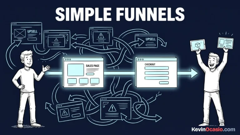
Every extra link on your page acts as an exit ramp. Links pull attention away from your main offer. Strip off your top site header, your sidebar, and your social buttons. Give your visitors two simple choices: read the page or buy the product.
Write for Fast Readers with Plain Spoken Copy
Your buyers won’t read sales copy word for word on a phone. They scroll fast and scan for key details. If you hit them with dense blocks of school prose, they’ll bounce. They’ll tap the back button before seeing your price.
Break your text into short chunks with bold lead-ins. Bullet lists make your key points easy to grab. A strict one-to-one landing page attention ratio keeps readers focused on your offer. Removing extra links stops visitors from wandering off before they decide to buy.
Keep your sentences casual and direct. Write like you’re talking to a friend at a kitchen table. Tell the reader what their current problem feels like. Explain why other fixes failed, and show how your simple guide solves it fast.
You don’t need to invent fake urgency. Never claim that your prices double at midnight. Honest copy that clearly shows the real outcome wins every time. Plain facts always beat cheesy sales hype.
Strip Friction and Speed Up Your Page Layout
A simple sales page only works if it loads fast on a phone. It needs to let buyers pay in seconds. Heavy page builders with big animations slow down your site. Slow pages kill your sales numbers before you even start.
Slow mobile speeds drive visitors away before anyone reads your headline. If your landing page load speed lags behind, mobile buyers on cell connections will leave. They won’t wait around for your checkout button to appear.
Stick to a single centered column with plenty of white space. A lightweight layout loads right away on any device. Buyers can type in their card details without annoying delays.
Here is how a heavy multi-app sales setup compares to running a clean, single-purpose text layout:
| Page Element | Overcomplicated Sales Page | Lean High-Converting Page |
|---|---|---|
| Layout Architecture | Multi-column with sliders and animations | Clean single-column text layout |
| Navigation & Links | Full header menu, footer links, and social icons | Zero exit links with a 1:1 attention ratio |
| Checkout Integration | Multi-step redirect through separate cart software | Single-click checkout or embedded order form |
| Software Cost | $97 to $297/month for heavy funnel platforms | $0 to $27/month using simple all-in-one tools |
| Mobile Load Speed | Slow load times with heavy asset weight | Instant mobile rendering under 2 seconds |
How to Write Simple High Converting Sales Page Copy with Lean Tools
You don’t need expensive software or complex setups to sell your guide online. You can build and host your pages using a dedicated sales funnel builder. It lets you write clean copy, take payments with Stripe or PayPal, and deliver your files from one simple dashboard.
The platform handles your checkout pages, email delivery, and customer lists without extra tools. My breakdown of Systeme.io walks through how the free dashboard works for beginners.
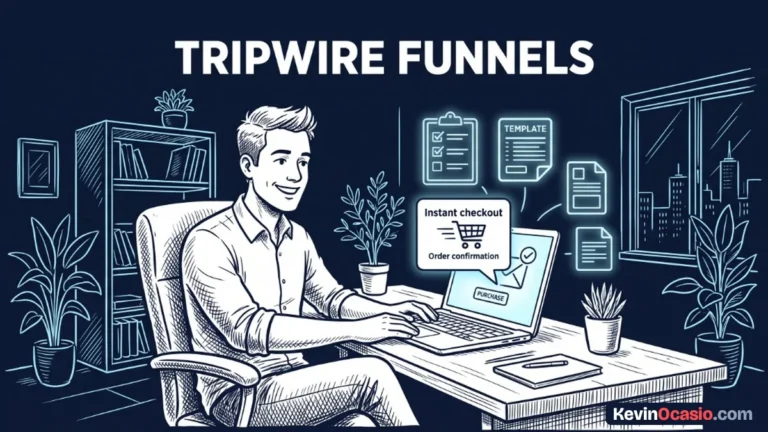
Pairing your sales page with an entry-level offer is a great way to get early traction. Setting up a low-cost tripwire funnel turns new email leads into paying buyers right away. It lets people test your work for just a few dollars.
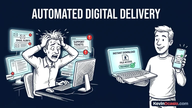
Hooking your checkout form straight into your email list makes delivery instant. Buyers get their download link seconds after their card clears. Fast delivery builds trust right away and cuts down on refund requests.
Launch Your First Offer Before You Tweak the Design
The fastest way to test an offer is to put your page in front of real people. Don’t waste days tweaking button colors or font sizes. Open a blank text document right now. Write down the single biggest result your product gives to the buyer.
Paste that copy into a basic single-column template. Add your buy button, and test your checkout link with a small charge. Once the payment clears and the file sends, share the link with your audience. Let real buyer data guide your next update.
Frequently Asked Questions About Simple Sales Pages
How long should a simple sales page be for a cheap digital product?
For products priced under $50, you only need 500 to 1,000 words of clear copy. Explain the problem, show your solution, and list what’s inside. Then give buyers an easy checkout button.
Do I need a video on my sales page to get buyers?
Skip the video when you’re starting out. Clean text with clear bullet points often sells better. Readers can scan the page at their own pace without waiting for a video to play.
Should I keep my site header and navigation menu on the sales page?
You should remove all top navigation menus and external links from your sales page. Extra links give visitors an easy excuse to leave your page without buying. Keep their attention on your offer.
How many times should I put the buy button on the page?
Two or three buy buttons work best on a short sales page. Place one right below your opening hook and offer summary. Put another in the middle after your feature breakdown, and add one more at the very bottom.
What is the biggest copy mistake beginners make on sales pages?
The most common mistake is listing features instead of the actual result. Buyers don’t care that your guide has ten chapters. They care that it saves them five hours or fixes an annoying problem.
Can I build a high-converting sales page without hiring a copywriter?
Yes, you can do it yourself without an agency. Write in simple, friendly words that answer your buyer’s biggest questions. Clear plain English connects better than stiff corporate sales talk.
What payment methods should I offer on the checkout form?
Offering credit card processing through Stripe along with PayPal covers almost every buyer. Giving people both options removes friction at checkout. It makes buying easy on both phones and desktops.